


During this week, I have been doing some of the research of my project. I will talk about the color i have chosen in my project, Which is red , Yellow and deep blue . The reason I used red and yellow is both of the color are presenting the superhero. Which is Iron Man and Spiderman
.
 \
\
For my logo design , I have used two of the superhero face to mix up to become a new icon for my poster icon because I am doing the film poster for that film. I think it should show the people to know who is the main character in the film 
The reason I used deep blue in the background is because which is the second color of Spiderman and I want the audience know the dark blue can represents knowledge, power, integrity, and seriousness.

Which is the front I used in the poster because it can presenting Spiderman.
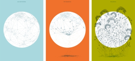
Stefanie Posavec is a data designer AND SHE often works with language, literature, and science. She didn’t like other designers, she uses a hand-crafted approach and claims she cannot program at all.
The images shown here are from an exhibition for a short story that was written by Hari Kunzru. The story took place in the future, post-apocalyptic London where knowledge and information were destroyed and nature took over.
To illustrate the story, Posavec have created a series of world maps illustrating this transition. The first map titled Accounting was constructed by mapping altitudes of capitol cities and the distances between them. The map mean to represent how people in the story mapped, measured, and gathered data on every aspect of life. The next illustration, Withering, depicts the electric storm that have destroyed all the data as the numbers crumble into dust. Wilding, the last map, shows weeds growing from the ruins and triumphing over data and information.
During this week, we would like to talk about the artist ”Edward Tufte” and and Iso Type,
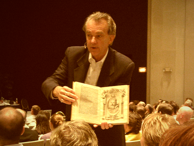
He is an American Statistician. Also being a professor of political science, statistics, and computer science at Yale University. He is a pioneer in the field of data’s visualisation. In his book called “The Visual Display of Quantitative Information” have mention few points.He like to using date to create graphics , how can the color co-operate with image, graphic editing skill can be improve and using those theory and practice thorough the design and here is an example of how can he used the data to create the graphic.
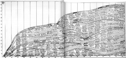
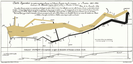
Which is a form for modern equivalent of visual communication. It can also using the visual to present the data and study on it. Those of the information have been abstracted in some schematic such as attributes or variables.
SubMap is a project by a group of Hungarian artists: Dániel Feles, Krisztián Gergely, Attila Bujdosó, Gáspár Hajdu and László Kiss. In their work they often visualize some sort of data, that fascinates them, on maps.
The specific project called Ebullition brings together data from Hungary’s largest news site (http://www.origo.hu/index.html) and presents it with 30 fps of animation. Any village or city mentioned in the news will be transformed into dynamic forces on the map. Each frame is a day, every second can see a whole month. Analysis data can be traced back to 1998 until 2010.
During this week, we would like to talk about the artist ” Joshua Davis” and 90s Club Culture.

He is an American designer and artist of new media. The best know of him must be the creator of praystation.com and a winner of the Prix As Electronica 2001 Golden Nica for “Net Vision / Net Excellence”. Before he become a designer, he is a programmer and write about HTML code.
The famous art work of him must be the Praystation.com and Dreamless.org.
In this part, I would like to talk about the 90s Club Culture. In 90s club culture , most of the things are related to pure and it become pure love, pure dance, pure revolution, pure drugs.After ward, there is a thing called” Rave”. It is changing the form of club culture. In the club, there are included large dance party, DJ performance, powerful sound system , metaphor and those are appear in late 1980s to describe the subculture that grew out of the acid house movement
During this week, we would like to talk about the artist ” Jamie Reid” an the style of British Punk.

He is a British Artist and anarchist with connections to the Situationists. In his work, we can see that he is using the newspaper to cut out the letters to make it become a topic. His famous work must be the Sex Pistols album Never Mind the Bollocks. He also define punk rock’s image. Those two are the art work of him.


Form the blog beginning, i have introduce Jamie Reid and what he did for the punk rock design. And the coming part , I will like to talk about punk music. Which is a music style appear in 1970s in UK.The rhythm of the song mostly is fast -paced of music with hard core of singing style and the lyrics all around political, anti-establishment and sex.


During this week, we have been talk through the two pioneers of Modernism: The Bauhaus and Maholey Nagy. When they are doing their design, they would like to add some of the modern design in it., it included some of the big point such as: rejection the styles of the past, reflect the modern society ,become a successful art movement and realism of Gustav Courbet. When they doing the design, they are also difficult with the subversion of traditional boundaries between high and applied art and a Utopian belief in art as a force for positive social change.In 1970, modernism has already became a dominant idea of art, it also get influenced by American critic Clement Greenberg and become Postmodernism.
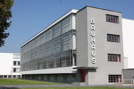
Which is a school with the revolutionary of art, it become a symbol of art school .They prefer using daily life t become a method for teaching rather then using the traditional teaching in the school.The only target with three subject, which is fine art, arts and design.Which also builded a new society in the school .
Modernism covers many creative disciplines, from design and art to influence architecture, music, and literature. The power of machines forces artists to strategically rethink their practices, the results are revolutionary, and still affect designers today. New technologies have provided opportunities for large-scale production. The machine itself has become the subject of modernism.
During this week, we have been talk through some of the basic design skill which is how to crate a grid box in indesign. There are so many way to create the box and I am trying to make with different form of box and colour it. I just found and example of John P. Corrigan. The last one I just mix up the colour again and look like different with the example I find on the internet.


This is my final work with web gallery.

Alan Schaller which is a London based photographer. He is good at using black and white to take photo. He like to use high contrast and realities to do the subject of his photo’s topic. He also worked for The Guardian, The Financial Times, Time Out and The Independent. His work also published in the inter a few times. He also become a brand ambassador for Leica Cameras.
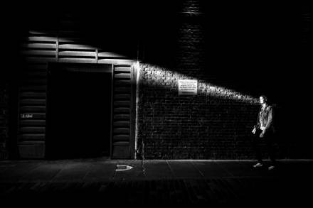
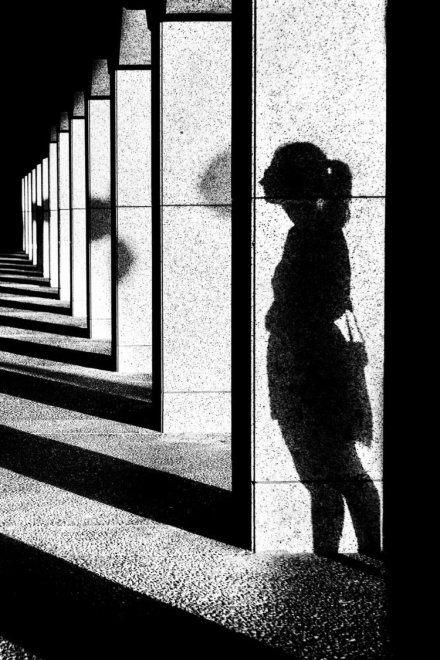
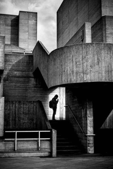
I have chosen three people to read about the meaning behind the photo and read this photo by using particle way and thinking how can I talk the same photo in my place. And the colour tone of those photo is grate and I would like to edit my photo on this style
